

The Best Iconic/ Classic Logos
 10. Megadeth is one of the coolest looking of all time. In particular cause it evokes a metallic almost 3D feel to it.
 9. Anthrax might have the most awesome logo of the Big Four. While, the look changed slightly over the years it is still pretty fucking awesome.
 8. AC/DC's lighting blot is iconic enough. This logo is all fucking classic!
 7. Few logos are classic and ironically evil as Slayer's wheel/ pentagram. You look at ,and you know what this band is all about. Truly one of the 80s most fucking awesome logos!
 6. With the S's written like lightning bolts, the Kiss logo is one of the most recognizable in the world.
 5. Iron Maiden's logo is so iconic that the font itself frequently is used for all things metal. You can't get more classic than that!!
 4. The Misfits logo, along with the Crimson Ghost, can be seen just about everywhere. Easily one of rock's best merchandised bands, the Misfits have a legacy all their own. And, their love for horror is very apparent. THE greatest punk band, ever, also have THE best logo in ALL of punk. End of story.
 3. The biggest band to come out of the thrash metal scene, Metallica, has one of the most recognizable logos in the history of music. BTW, I hated when the logo changed for those "shitty" albums, you know which ones I mean!!!
 2. While not as popular with the mainstream as the others on the list, King Diamond's classic logo is one of the coolest around. I mean it has a fucking bat (note how many abnd on this list have a bat wings on this list) and a symbol on it. That makes it a top place holder on any fucking logo list!!!!
 1. The top spot goes to the metal god's band, Judas Priest!!! This one is easily the coolest of the classic/ iconic logos. It's probably the most complex of the ones on THIS list, but just wait till the next list, starts...
 7. Speaking of Satan, the first true black metal act of the list comes in the form of Sweden's evil Dissection. One of my personal favorite black metal acts, they had a cool logo, that could still be readable.
 6. The best of the 80s logos has to belong to thrash/ speed metal masters Dark Angel. Come on, the fonts are cool and it has bar wings for fuck's sake!!!!
 5. The first death metal that I ever owned every album of, has super cool fonts. And, depending on what album or shirt you are looking at, a dragon for a T or dripping blood!!! Now THAT is fucking metal!!!
 4. Impaled has some of the coolest fonts in the metal world. This one proves you don't need blood, pentagrams, bats, inverted crosses, whatever, to make a cool looking logo.
 3. Cradle of Filth's logo gives you a good idea of the gothic, black metal music you are in for. You know these guys will surely sign about scary, evil, and gothy things. Like all the best logos it simply fits the band.
 2. One of THE most infamous bands in all of metal, Mayhem, have a logo that is just legible and cool enough to make the list. This one has wicked fonts, bat wings, and upside down crosses. You see this one works. Unfortunately, too many black metal bands decided to make impossible to read logos, after seeing this, probably...
 1. The first death metal act I ever got into, Morbid Angel, has my ALL time fav logo. This one is just a greatest hits of satanic imagery: inverted crosses, pitchfork, pentagram, pagan symbols, and two pointy tails. In other words, definitely a band to piss your mom off. To me, this is THE definitive logo with complex fonts. As it is easy to read, cool, and evil as fuck.
So, there's my list. Do you agree? Was I missing a band? Who would you have put in here? Tell me. I would love to know. And, remember keep metal and hard rock alive!! Horns up!!!
----------------
Now playing: Anthrax - Pipeline
via FoxyTunes
 10. Megadeth is one of the coolest looking of all time. In particular cause it evokes a metallic almost 3D feel to it.
 9. Anthrax might have the most awesome logo of the Big Four. While, the look changed slightly over the years it is still pretty fucking awesome.
 4. The Misfits logo, along with the Crimson Ghost, can be seen just about everywhere. Easily one of rock's best merchandised bands, the Misfits have a legacy all their own. And, their love for horror is very apparent. THE greatest punk band, ever, also have THE best logo in ALL of punk. End of story.
The Coolest Fucking Logos Ever!
 10. The fathers of black metal, Venom, have what is one of the coolest logos of ANY 80s band. Definitely a sign of things to come.
 9. Death are the first true death metal ,and their fucking awesome logo has a reaper, a cross (inverted in the early days), fire, a spider and a web, and blood! In other words it FUCKING RULES!!! They also happen to be my all time fav death metal, act, by the way.
 8. Thrash masters Possessed could be said to be have the first death metal album. What is definitely true is that their logo, with two inverted crosses, fire, and a pointed tail surely tell you about the evil contained in the lyrics. You knew this band, for sure, was, and did, sign about good old Lucifer.
Unlike the group before this one is NOT based on icon status but rather just how fucking cool the logo looks. Notice all will be black and death metal bands, cause, well, they have the best logos, usually.
NOTE: I wanted to stick to logos you can still read, hence some of the crazier black/ death metal logos are not here.
NOTE: I wanted to stick to logos you can still read, hence some of the crazier black/ death metal logos are not here.
 10. The fathers of black metal, Venom, have what is one of the coolest logos of ANY 80s band. Definitely a sign of things to come.
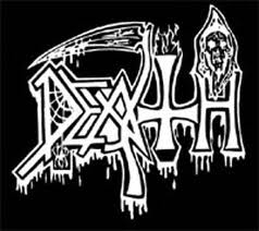 9. Death are the first true death metal ,and their fucking awesome logo has a reaper, a cross (inverted in the early days), fire, a spider and a web, and blood! In other words it FUCKING RULES!!! They also happen to be my all time fav death metal, act, by the way.
 7. Speaking of Satan, the first true black metal act of the list comes in the form of Sweden's evil Dissection. One of my personal favorite black metal acts, they had a cool logo, that could still be readable.
 6. The best of the 80s logos has to belong to thrash/ speed metal masters Dark Angel. Come on, the fonts are cool and it has bar wings for fuck's sake!!!!
 3. Cradle of Filth's logo gives you a good idea of the gothic, black metal music you are in for. You know these guys will surely sign about scary, evil, and gothy things. Like all the best logos it simply fits the band.
 1. The first death metal act I ever got into, Morbid Angel, has my ALL time fav logo. This one is just a greatest hits of satanic imagery: inverted crosses, pitchfork, pentagram, pagan symbols, and two pointy tails. In other words, definitely a band to piss your mom off. To me, this is THE definitive logo with complex fonts. As it is easy to read, cool, and evil as fuck.
So, there's my list. Do you agree? Was I missing a band? Who would you have put in here? Tell me. I would love to know. And, remember keep metal and hard rock alive!! Horns up!!!
----------------
Now playing: Anthrax - Pipeline
via FoxyTunes


0 comments:
Post a Comment